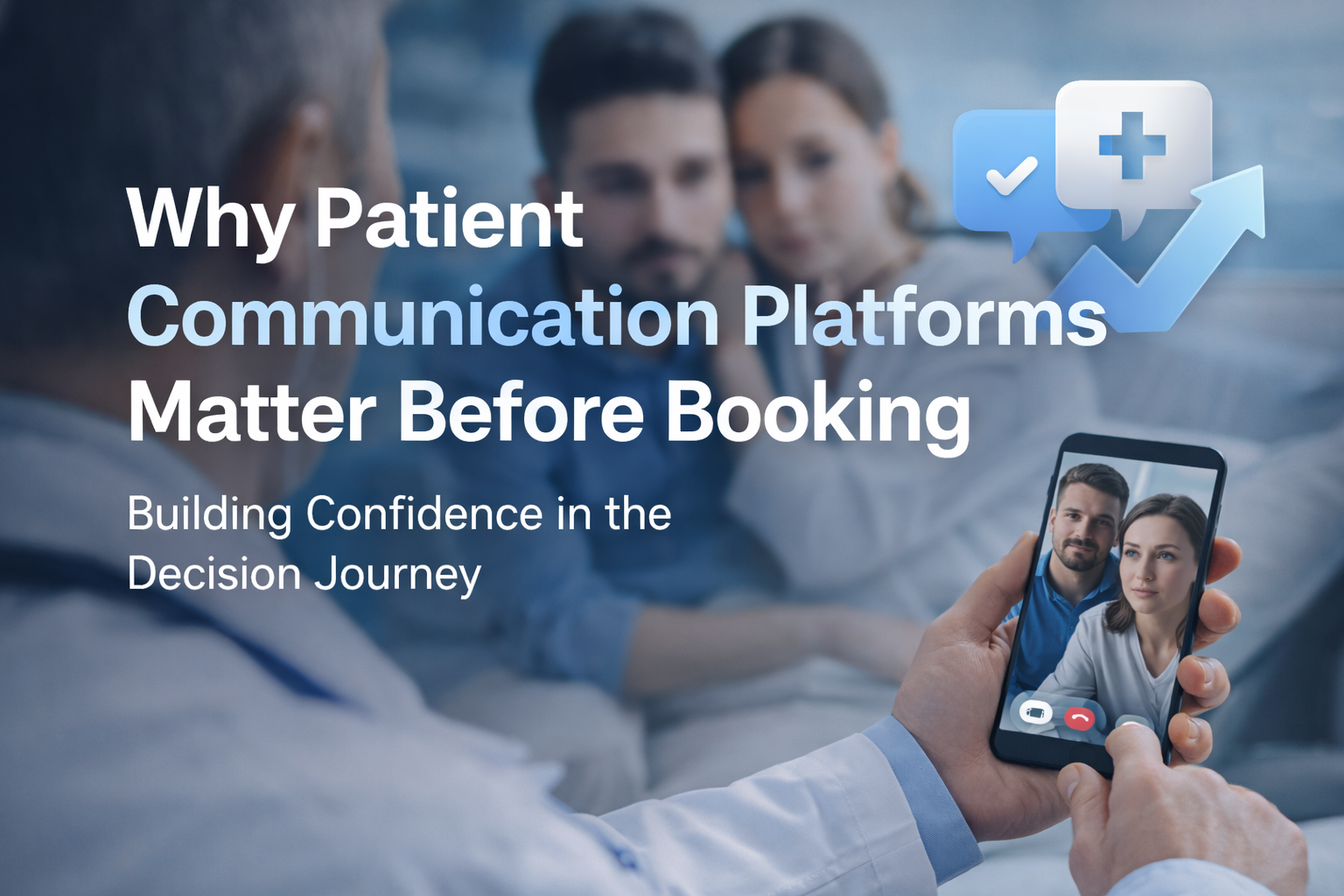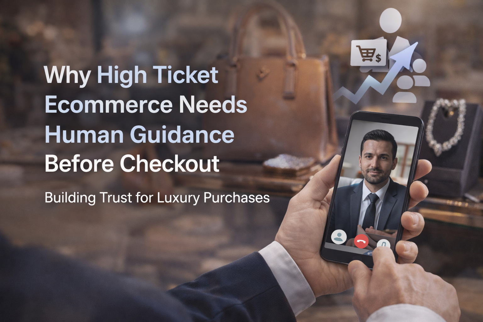
High-ticket ecommerce rarely loses because the product looks bad. The photography is sharp, the specs are complete, and the brand story is polished. The drop happens later, when a serious price tag turns “add to cart” into a personal decision with consequences.
At Why High-Ticket Ecommerce, checkout stops being a technical step and becomes a moment of risk assessment. People hesitate not because they doubt the item is real, but because they doubt the outcome they will live with after the box arrives.
When price rises, the decision changes shape
A low-cost purchase is easy to correct. If it disappoints, the buyer shrugs, learns, and moves on. With high-ticket items, the brain treats the purchase more like a commitment: money, space in the home, time to set up, possible coordination with installers, and the social pressure of “I should have chosen better.”
This is why high-ticket shoppers can look decisive all the way through the product page, then stall right before paying. The site did its job explaining the object, yet the customer still feels alone with the decision.
A high price also changes what “value” means. It is no longer a math problem of features divided by dollars. It becomes a question of fit, confidence, and what happens if reality differs from the marketing.
The doubts in high-ticket ecommerce that surface right before payment
Most hesitation at checkout has very little to do with color options or processor speed. It is about uncertainty that feels costly to get wrong.
Shoppers often carry a quiet set of questions they do not want to ask in public reviews, and cannot resolve with a spec sheet. After a while, silence itself becomes an answer, and the safest move is to postpone.
Common checkout-stopping concerns tend to cluster around a few themes:
- Fit and suitability
- Delivery and timing
- Returns and refunds
- Post-purchase support
- Real-life performance
Notice what is missing: features. Features matter earlier. At the final step, reassurance matters more.
Product pages explain features, but fear lives elsewhere
High-ticket product pages are usually built to persuade with clarity: dimensions, materials, performance metrics, warranty length. That content is necessary, yet it is rarely sufficient when the buyer’s real question is, “Will this work for me?”
Fear is contextual. It depends on the buyer’s space, constraints, and expectations. A static FAQ cannot see the customer’s situation. A comparison chart cannot confirm that a specific configuration will fit through a narrow doorway, match an existing system, or meet a deadline.
Even when answers exist somewhere on the site, the customer has to hunt. Searching is effort, and effort increases perceived risk. The mind reads friction as a warning sign: “If it’s hard to get help now, it may be worse after I pay.”
Checkout is where doubt becomes expensive
By the time a customer reaches checkout, they have already done work. They have invested attention, compared alternatives, and mentally pictured ownership. This is a high-intent moment.
Yet checkout screens often feel like a dead end: form fields, shipping estimates, payment options, and little else. The experience becomes transactional right when the buyer needs relational reassurance.
When uncertainty appears at this stage, abandoning the cart is not rejection. It is self-protection. The customer chooses the option that preserves flexibility: walk away, think about it, ask a friend, wait for a better moment.
Why automation struggles with high-ticket nuance
Automation works best when the question is stable. “What are your hours?” “Do you ship to my zip code?” “What is the warranty term?” Those are clean inputs with clean outputs.
High-ticket questions are messier. They show up as half-formed concerns, not precise queries. People ask in stories: “I live in a condo and I’m worried about delivery,” or “I’m replacing an older model and I don’t want surprises.” What they want is not a link. They want a knowledgeable person to interpret the situation and confirm a safe path.
A chatbot that replies with generic snippets can backfire. It signals that the brand cannot meet the moment with care. That perception increases doubt, even if the information is technically correct.
Here is a practical way to think about the division of labor:
| Customer need at checkout | Best support type | Why it works |
|---|---|---|
| Simple policy confirmation | Self-serve FAQ snippet | Fast, predictable, no back-and-forth |
| Order status or basic logistics | Automated assistant | Structured data, clear outcomes |
| “Is this right for my use case?” | Human guidance | Requires context, judgment, and reassurance |
| “What happens if it doesn’t work out?” | Human guidance | Emotional risk needs calm, specific explanation |
| Complex configuration choices | Human guidance | Prevents costly mistakes and returns |
| Edge cases (delivery constraints, timing, compatibility) | Human guidance | Small details change the answer |
Automation still has a role. The point is to avoid asking automation to do a job it is not built to do: reduce emotional risk.
Human guidance restores confidence without pressure
When shoppers can reach a real person before checkout, something subtle changes. The purchase stops feeling like a leap taken alone. It becomes a supported decision.
Often, the most valuable part of the interaction is not the factual answer. It is the tone: calm, competent, accountable. People relax when they sense the brand is present and prepared to help after payment, not only before it.
This type of help does not need to be long to be effective. A two-minute confirmation can remove the last excuse to delay. A short message that sets expectations about delivery, setup, or returns can turn anxiety into readiness.
The goal is not to push. It is to confirm.
After a paragraph of reassurance, it helps to name what good guidance actually does:
- Clarify suitability: Confirm the choice fits the customer’s situation, not just the product category.
- Explain next steps: Set expectations for delivery, setup, timelines, and what the customer needs to do.
- Reduce perceived risk: Make returns, warranty, and support feel real, specific, and reachable.
- Remove last-mile friction: Help with financing steps, address validation, or configuration details.
When guidance is done well, the customer feels respected. They also feel smarter, which is a powerful emotional reward right before paying a premium price.
Making checkout feel connected to help
A common mistake is hiding assistance behind a tiny link in the footer. High-ticket shoppers do not want to search for support while their credit card is already in hand.
The most effective pattern is visible availability at the exact moment of hesitation: on the product page near decision points, in the cart, and inside checkout. Even if the customer never clicks, presence creates confidence.
That does not mean cluttering the interface. It means designing a calm, credible “help layer” that feels like a quiet safety net.
The channels can vary, but they should share one trait: fast access to a real person when needed.
What “human guidance” can look like in practice
Human support does not have to mean a full call center with long hold times. Many high-ticket purchases need only light-touch help, provided by a small team trained to handle decision risk.
Some brands use scheduled consultations for complex categories. Others offer text-based help that can escalate to voice when necessary. The best model depends on product complexity, average order value, and how often questions cluster around edge cases.
A few practical options that commonly work well:
- Live chat with named specialists
- SMS or WhatsApp-style messaging during business hours
- Click-to-call with short “fit check” calls
- Scheduled video consults for configuration-heavy purchases
The best channel is the one that matches urgency. Checkout doubts are time-sensitive. If the customer has to wait until tomorrow, the moment often passes.
Training for clarity, not scripts
High-ticket guidance fails when it sounds like a sales script. People can sense when they are being steered. Pressure increases defensiveness, and defensiveness kills conversion.
Strong guidance sounds like a capable store associate: curious, direct, and comfortable saying, “This might not be the right option for you.” That honesty builds trust and often leads to a better sale, even when it changes the product chosen.
Training should focus on three skills:
- asking a small number of high-quality questions,
- confirming what matters most to the buyer,
- summarizing the plan in plain language.
A short written recap after the conversation can be surprisingly effective. It gives the customer something to hold onto when they return to checkout.
Measurement that respects the real goal
If you only measure conversion rate, you may accidentally reward aggressive tactics that harm long-term trust. High-ticket ecommerce lives on reputation, low regret, and post-purchase confidence.
Better measurement looks at the whole arc: did guidance reduce abandonment, lower returns, and increase satisfaction?
Useful signals include time-to-purchase after first contact, assisted conversion rate, refund rate by assisted versus unassisted orders, and the share of conversations that end with a clear next step.
Even when a customer does not buy immediately, a high-quality interaction can create a future purchase. In high-ticket categories, the decision window can be longer, and support becomes part of the brand memory.
Turning checkout from a cliff into a handrail
Checkout should not feel like the moment the brand disappears. It should feel like the moment the brand becomes accountable.
When high-ticket ecommerce adds human guidance before payment, the experience starts to resemble the way people buy expensive items in person: ask a question, receive a confident answer, and proceed with a steadier mind.
That steadiness is the real conversion strategy. Not more urgency. Not louder popups. Just a clear signal that if anything feels uncertain, there is a competent human ready to help.