Hotel website visitors are not casual browsers. Most have already chosen a destination, narrowed dates, and decided that staying at your property is at least a real possibility. They arrive with intent, not curiosity.
That makes your website the highest value traffic you will ever get.
And it also means small gaps feel big. When uncertainty shows up and no one answers it, a guest does what humans have always done when they feel unsure: they look for safety elsewhere, often on an OTA that feels familiar, or on a competitor’s site that simply explains things better.
Table of Contents
The hospitality website conversion needs to be on point
A typical booking session is less “shopping” and more “confirming.” Guests check availability, scan room types, compare pricing, review policies, and look for reassurance that the stay will match expectations. The decision is already leaning toward “yes.” The final step is removing friction and doubt.
One overlooked pattern: guests rarely hesitate because they cannot find a lower price. They hesitate because they cannot predict the experience.
They ask silent questions like: Will this room be too small? Is parking easy? Is the pool actually open? What happens if my flight gets delayed? Can I bring my dog without drama? Will I be stuck paying a fee I did not notice?
Your conversion rate rises when your website answers those questions before the guest has to go hunting.
“Presence” is a conversion strategy
Presence does not mean pushing a pop-up that says “Need help?” It means making it feel like someone is available, attentive, and clear, even if the guest never uses chat or calls the desk.
Presence shows up in the way information is structured. It shows up in the tone of your policies. It shows up in microcopy on the booking engine that anticipates worry and resolves it in one sentence.
A good hospitality website quietly communicates: “You are in good hands. Here is what to expect. Here is how to book. Here is what happens if plans change.”
When guests feel cared for, they commit faster and abandon less.
Make the booking path unmistakable
Many hotel sites fail conversion basics by forcing the guest to interpret the interface. The booking path should be obvious within seconds: choose dates, choose room, choose rate, confirm.
Confusion often comes from competing calls to action, buried availability search, and room pages that read like brochures rather than decision pages.
The goal is not to cram more content onto the screen. The goal is to reduce decisions that do not matter and spotlight the decisions that do.
After you have a clear booking path, review these common friction points and decide what you can simplify this month:
Even small adjustments here tend to show up quickly in reduced drop-off between room selection and checkout.
Reassurance is built from proof, not promises
Hospitality is emotional. Guests are buying sleep, comfort, and confidence. Your website should make proof easy to see and hard to misread.
That proof comes from three places: visual truth (accurate photos and video), social truth (reviews and guest sentiment), and operational truth (policies and expectations).
If you are choosing where to invest first, prioritize the reassurance elements that match your guest’s biggest anxieties. A business traveler wants quiet, Wi‑Fi reliability, and checkout speed. A family wants space, pool rules, breakfast details, and parking simplicity. A couple wants ambiance, privacy, and clarity on late arrival.
Here is a practical way to map reassurance elements to implementation details:
| Reassurance element | What guests are really asking | Strong website treatment |
|---|---|---|
| Real photography | “Will it look like this in real life?” | Current photos, consistent lighting, captions that name the room type shown |
| Reviews placed with intent | “Has someone like me stayed here happily?” | Pull review snippets onto room pages and booking steps, not only a separate reviews page |
| Clear policies | “What could go wrong financially?” | Short summaries with links to full terms, written in human language |
| Amenity specificity | “Does this fit my routine?” | Exact details: hours, seasonal closures, reservation rules, fees, and limits |
| Location clarity | “Will getting there be stressful?” | Parking instructions, transit options, landmarks, and realistic drive times |
Notice what is missing from the table: generic superlatives. “Best in town” does not settle doubt. Specifics do.
Policies should read like hospitality, not legal defense
Policies are where uncertainty spikes. Guests do not read them because they enjoy rules. They read them because they fear a penalty.
Most hotel policy sections are written as if the goal is to protect the property from the guest. A conversion-focused policy section protects the guest from unpleasant surprises while still setting boundaries.
A few practical moves help immediately:
These are the policy topics guests look for most often:
When policy language is direct and calm, guests feel respected. Respect converts.
Rooms are not products, they are outcomes
Room pages often fail because they describe features without connecting them to the guest’s experience. Square footage and bed size matter, yet guests also want to picture the stay: where they will put luggage, whether the sofa fits a kid at bedtime, whether the bathroom feels tight, whether the view is real.
High-converting room pages do a few things consistently:
They anchor the decision with a clear “who this is for” statement, they show the room honestly, and they make the next step obvious.
Strong room presentation usually includes a tight set of essentials (not a wall of icons), plus a few details that reduce doubt. Examples: “quiet side of the building,” “shower only,” “connects to,” “steps from elevator,” “desk with ergonomic chair,” “crib available on request.”
One sentence can do a lot of work when it tells the truth a guest cares about.
Speed and mobile usability are revenue topics
In hospitality, conversion is often mobile-first even when final booking happens on desktop. Guests search from the car, on the couch, between meetings, and in airport lines. If your mobile experience is slow or fussy, the guest does not wait. They bounce, then buy somewhere else.
Focus on the handful of technical issues that tend to hurt hotel sites the most:
A strong standard is simple: the site should feel fast, the booking steps should feel stable, and the user should never wonder if their selection “saved.”
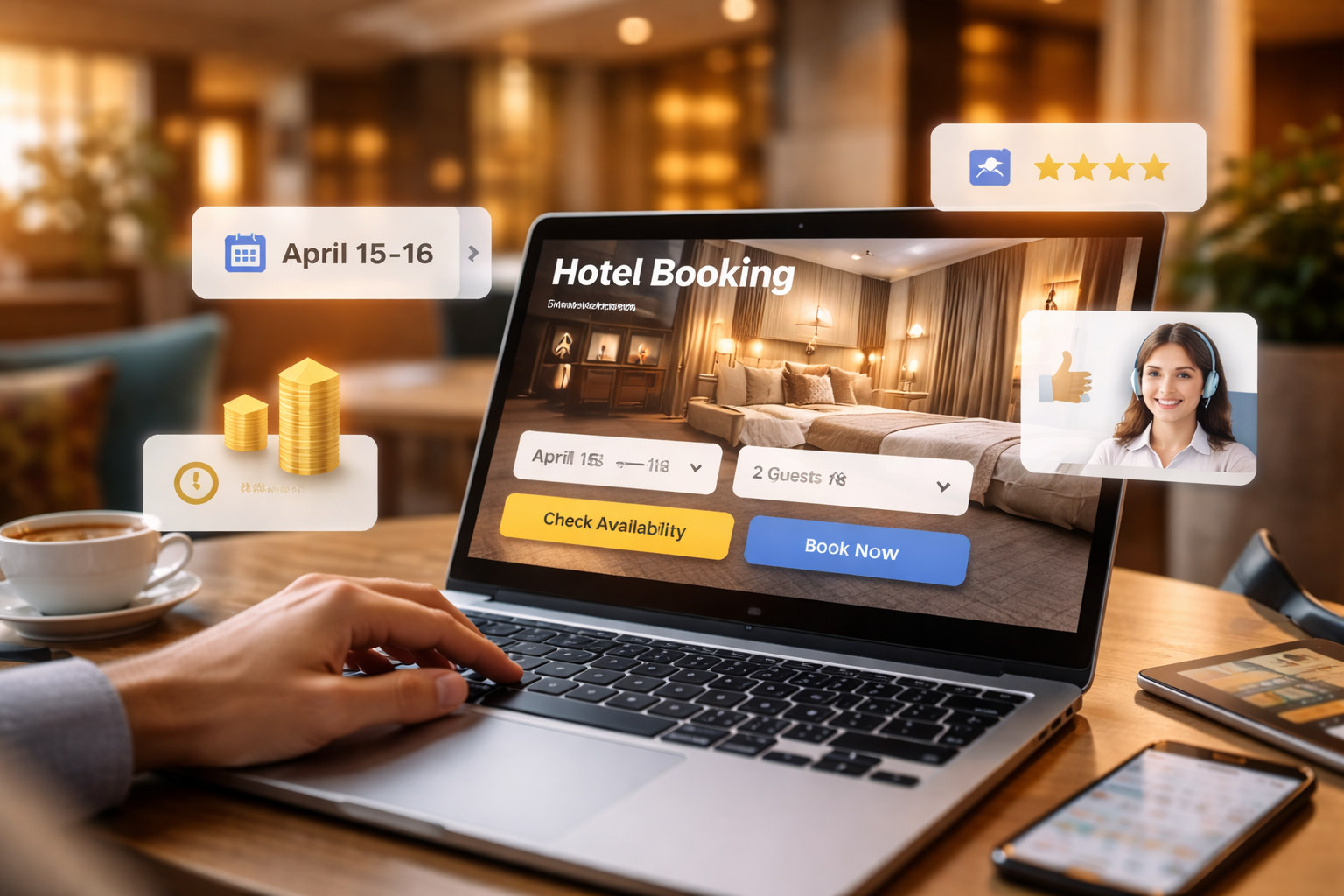
Add real-time help without interrupting the booking flow
If uncertainty is the enemy of conversion, real-time help is the antidote. The key is offering help in a way that supports the decision, not distracts from it.
Live chat works well when it is treated like a digital front desk, not a marketing widget. The best implementations are honest about response times, route questions to the right team, and keep transcripts so the guest does not repeat themselves.
If you cannot staff chat 24/7, you can still provide presence:
Use an offline mode that offers answers and a clear next step (email response time, call hours, text-back option). Add a “Call us” tap target that works properly on mobile. Offer a short FAQ next to the booking engine for the questions that block checkout.
If you do implement chat or messaging, a simple operating plan prevents it from becoming noise:
When guests feel there is a human behind the website, they take the next step with less hesitation.
Design your site for “compare and confirm” behavior
Guests do not move through your site like a story. They jump around. They compare rooms, open policies, check maps, and return to rates. Your job is to make that non-linear behavior easy.
A few high-impact patterns help:
Keep the guest’s selections persistent (dates, number of guests, room filters). Provide “back” behavior that does not punish them with a reset. Make “view details” available without sending them into a dead-end page.
Also, build gentle reassurance into the booking funnel. When a guest is about to enter payment details, they are thinking about risk. Remind them of the cancellation terms of the chosen rate in one clean line. Confirm check-in times. Make contact options visible, even if they are not used.
Measure uncertainty, not just clicks
Conversion work improves faster when measurement matches guest psychology. The standard funnel metrics matter, yet they do not tell you why guests hesitate.
Add tracking that reveals where confidence drops:
Pair that with qualitative signals. Watch a handful of session recordings each week. Read chat transcripts. Listen to call snippets when possible. The goal is to identify repeated moments of doubt, then remove them with clearer content or better interface choices.
When you treat uncertainty as a design and service problem, your website starts behaving like a great host: it anticipates needs, answers calmly, and stays nearby without hovering. Bookings tend to follow that kind of care.