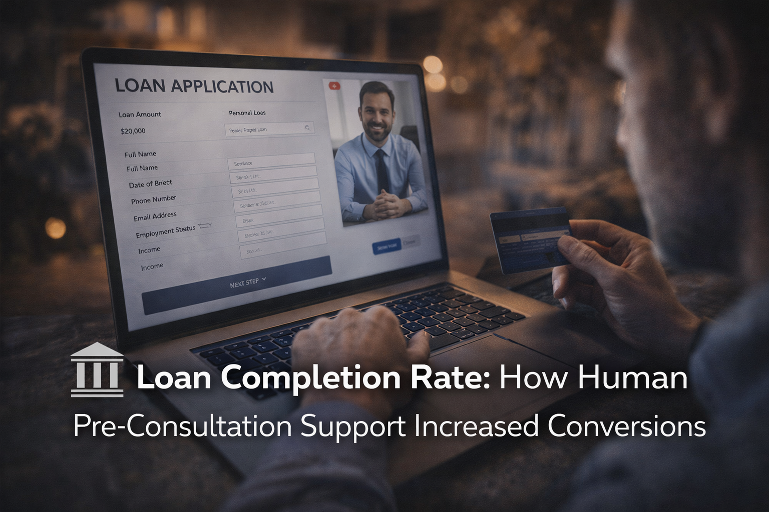
Many digital banking teams face the same frustrating pattern: strong traffic, clear product demand, and a healthy number of users starting a loan form, only to see a large share disappear before submission.
That gap matters more than it first appears. Loan applicants are rarely casual visitors. They often arrive with a specific need, compare options carefully, and begin the process with real intent. When loan application abandonment rises, it usually points to friction at the exact moment a bank or fintech should be turning interest into action.
Reducing that friction is not only a UX task. It is a conversion strategy, a trust strategy, and a revenue strategy. When lenders pair cleaner digital flows with real time human interaction, they make it easier for qualified users to keep going, ask questions, and finish what they started.
Table of Contents
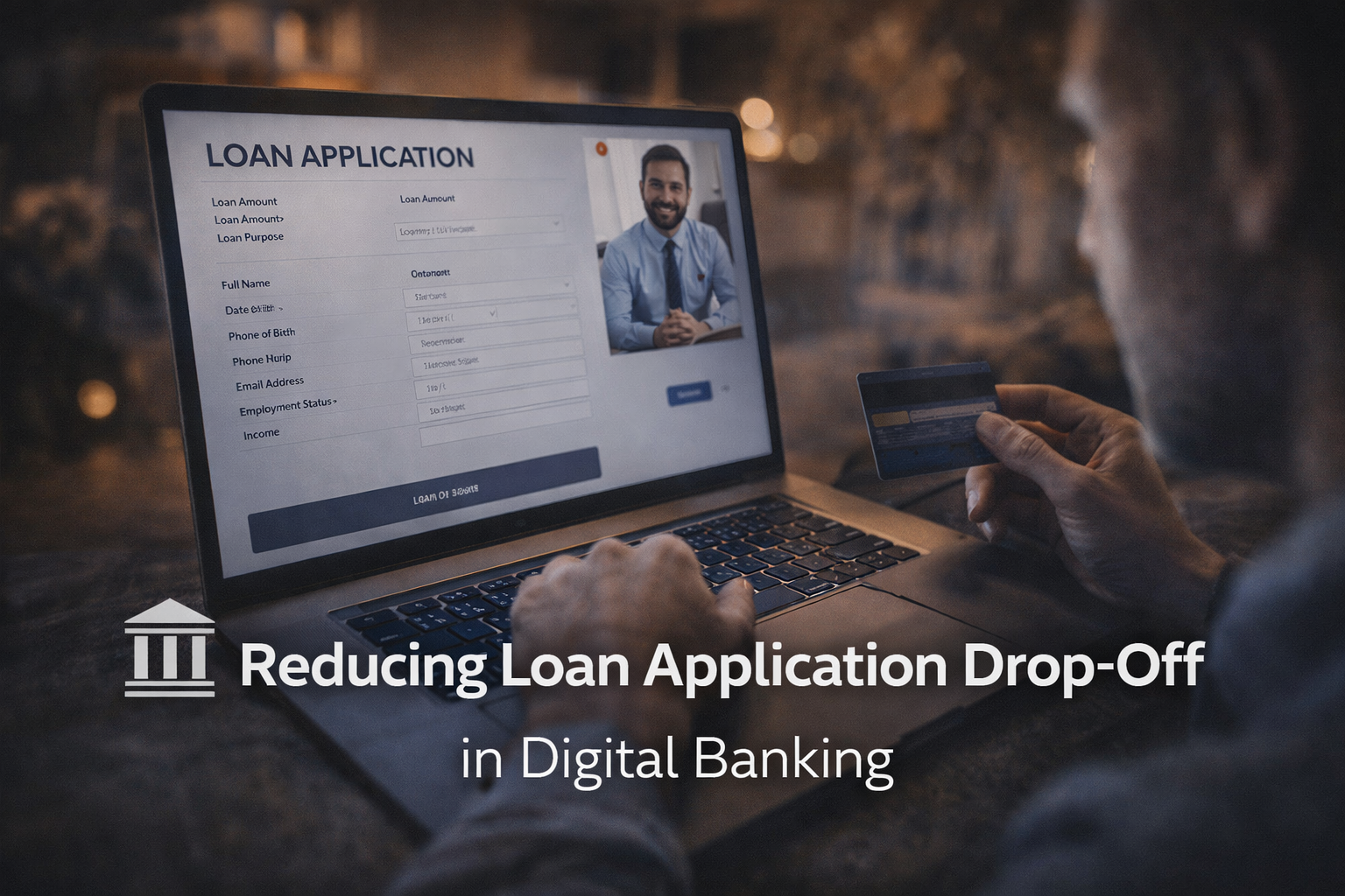
Loan application drop-off in digital banking
Loan application drop off in digital banking refers to users who begin an application but leave before completing it. In practical terms, this means a prospect clicks into the form, enters partial information, maybe uploads a document or two, then exits without submitting. For banks and financial service providers, that abandoned intent represents lost opportunity that was already expensive to attract.
This problem is common across consumer lending, small business lending, credit products, and refinancing flows. A user may spend several minutes comparing rates, reviewing terms, and checking eligibility, only to stop when the process feels too slow, unclear, or risky. That is why loan application abandonment can remain high even when marketing is performing well and product demand is strong.
The key point is this: high-intent users still hesitate. Interest does not eliminate doubt. Financial decisions carry emotional weight, and that changes user behavior. A person can want the loan and still worry about rejection, privacy, monthly payments, hidden terms, or what happens after they click submit.
After that tension shows up, even a small point of friction can trigger drop-off.
| Friction point | Likely user reaction | Conversion impact |
|---|---|---|
| Long application form | “I will finish this later” | Lower online loan application completion |
| Unclear requirements | “I may not have what they need” | More abandonment before document upload |
| Vague terms or rates | “I do not want surprises” | Reduced trust and lower submit rate |
| No live help available | “I cannot get a quick answer” | High exit rate during hesitation |
| Sensitive data request too early | “This feels risky” | Users stop before completion |
When teams look only at form analytics, they often miss the bigger issue. The user is not always dropping because demand is weak. Often, the user is dropping because the decision feels too exposed to complete without reassurance.
Digital banking conversion challenges in loan applications
Digital banking conversion challenges in loan applications tend to build on one another. A form may be technically functional yet still underperform because it asks too much, too early, in language that feels legalistic rather than helpful.
Long and complex forms are a major barrier. Many lenders collect every possible detail upfront, even when only a smaller set of fields is needed to qualify the lead or move the applicant into the next stage. Each extra question increases effort, interrupts momentum, and gives users another reason to pause.
Lack of transparency creates a second layer of resistance. If borrowers cannot quickly see what information is required, how long the process takes, what documents they should prepare, or when they will hear back, uncertainty grows. Confusing requirements make that worse. A user who sees requests for employment details, income proof, identity checks, and credit-related disclosures without plain-language guidance may feel trapped in a process they do not fully grasp.
Poor UX and inadequate user experience then turn concern into action, and that action is leaving the page. Common issues include weak progress indicators, unclear error messages, mobile-unfriendly layouts, difficult file uploads, and no way to save progress cleanly across sessions. Banking customer experience matters here because loan applications are rarely one-click decisions. They need confidence at every step.
A few recurring blockers tend to show up again and again:
- Too many required fields
- Unclear eligibility rules
- Hidden steps
- Weak mobile design
- Repetitive data entry
- Delayed response expectations
When several of these problems appear together, digital banking conversion rate suffers even when the audience is well targeted.
Financial application abandonment causes
Financial application abandonment causes are not only operational. They are psychological. Money decisions trigger caution, and caution increases sensitivity to friction.
Trust issues sit at the center of many abandoned applications. Users are asked to share income data, identity details, employer information, and sometimes banking records, impacting the overall user experience. That is deeply personal information. If the interface feels generic, the security language is vague, or the lender does not look credible, hesitation rises fast.
Fear of rejection is another major factor. Many applicants worry that a completed form could result in a hard inquiry, a declined application, or a visible record of failure. Even users who are likely to qualify may stop if they feel the outcome is uncertain and the process offers no reassurance.
Lack of guidance makes both concerns heavier. In lending, silence is rarely neutral. If users cannot ask what a term means, whether a document is mandatory, or how a field affects approval, they often assume the worst.
That is why the most common causes usually look like this:
- Trust gap: limited proof that the lender is credible, secure, and transparent
- Fear of rejection: concern that submitting will lead to a negative outcome
- Data sensitivity: discomfort with sharing financial and personal information
- Lack of guidance: no easy way to get help before submitting
- Term confusion: uncertainty around rates, repayment, or eligibility language
Financial services conversion improves when these emotional blockers are treated as real conversion barriers rather than side issues.
User behavior in online loan applications
User behavior in online loan applications is rarely linear. People compare rates, open multiple tabs, return later on another device, and revisit the application after checking pay stubs or discussing the decision with a partner. That means many applicants do not finish in one sitting, even when they intend to move forward.
This research-heavy process makes session-based drop-off data easy to misread. A visitor who leaves is not always lost. They may be reviewing competitors, checking their credit profile, gathering documents, or waiting until they feel more certain. Still, every pause creates risk. If the lender does not re-engage effectively, delay turns into abandonment.
There is also a clear hesitation point before users submit sensitive information. Early browsing feels low risk. Submission feels different. It carries emotional weight because it can affect credit, finances, and future options. The closer the user gets to commitment, the stronger the need for clarity and reassurance.
That is why online loan application completion depends on more than form design. It depends on supporting the user through a decision process that is careful, comparison-driven, and often interrupted.
How to reduce loan application drop off
To reduce loan application drop off, lenders need to lower effort while increasing confidence. Those two goals should work together. A shorter form helps, but it is not enough if the user still feels unsure. Strong trust signals help, but they will not rescue a confusing workflow.
Start with process simplification. Ask only for information needed at the current stage. Break long forms into smaller steps. Show progress clearly. Offer save-and-return functionality that actually works. Make mobile completion easy, especially for document upload. These changes reduce perceived workload and help users stay in motion.
Communication matters just as much. Explain why information is requested. Use plain language for rates, timelines, soft versus hard credit checks, and next steps after submission. If a user knows what is happening and why, uncertainty falls. When uncertainty falls, completion rises.
Trust signals should be visible at the exact points where anxiety spikes. Security messaging, privacy reassurance, customer reviews, lender credentials, and realistic response-time expectations all help. They work best when placed near sensitive fields and submission points rather than buried in a footer.
A practical conversion framework often includes:
- Simplify: reduce fields, remove duplication, and break the form into manageable steps
- Clarify: explain requirements, timelines, and eligibility in plain language
- Reassure: show privacy, security, and credibility signals where hesitation appears
- Guide: provide next-step prompts so users never wonder what happens after each action
- Recover: use reminders and smart follow-up for users who save progress but do not submit
For teams looking to improve loan conversion rate, this is where related content can help. Resources on checkout abandonment, human versus chatbot support, high-intent traffic, and lender case studies can give internal teams a stronger model for diagnosing friction across the funnel.
Real time support in digital banking conversion
Real time support in digital banking conversion can change the outcome of an application in minutes. When users have a question and get an immediate answer, they are much more likely to continue. When they have to leave the form to search a help center, email support, or wait until business hours, momentum disappears.
This matters because many application questions are small but urgent. Does this rate apply to my profile? Is this a soft credit check? Can I upload a bank statement instead of a pay stub? What counts as annual income? A delay on questions like these often leads directly to abandonment.
Real time customer support banking teams offer can take several forms: live chat with trained staff, click-to-call options, instant callback offers, or live reception that routes high-intent users to the right team quickly. The format matters less than the speed and clarity of the response.
A strong support layer can increase loan application completion in three ways. It answers questions instantly, reduces uncertainty at the moment of hesitation, and gives users confidence that someone will help if an issue appears later. That sense of access is powerful in financial services, where many decisions are cautious by nature.
Human interaction in financial services conversion
Human interaction in financial services conversion remains a major differentiator because borrowing is not a purely technical transaction. It is a trust decision. Applicants want to feel that the institution is reachable, credible, and willing to explain what matters.
That is where live support often outperforms fully automated flows. Chatbots can help with routine routing, but they often struggle when a user asks a nuanced question about eligibility, documentation, repayment terms, or timing. A person can adapt, reassure, and respond with context. That can be the difference between hesitation and submission.
Human support also helps translate complexity into clear action. Financial language can be intimidating even for well-qualified users. Terms like APR, origination fees, prequalification, debt-to-income ratio, or variable rates are familiar to lenders, but not always to applicants. When someone can explain them in plain language, trust rises.
This support role is not about adding friction through manual intervention. It is about placing a human layer where it has the most impact. Think of it as guided conversion: the digital process stays efficient, while the user gains access to reassurance exactly when it is needed.
Combining seo lead generation and live reception in banking
Combining SEO lead generation and live reception in banking creates a stronger path from intent to conversion. SEO brings in users who are already searching for answers, rates, lenders, and loan options. These are often high-intent visitors, especially when content matches specific borrowing needs and local or product-focused searches.
Lead generation tools then capture interest before it fades. Prequalification forms, rate check tools, downloadable checklists, and saved-application prompts give users a way to stay connected even if they are not ready to complete the full form immediately. This is especially useful for applicants who need more than one session before deciding.
Live reception is what helps convert that interest when hesitation appears, significantly enhancing the overall user experience. A user who arrives from organic search, starts a form, and hits a point of uncertainty should not feel alone in the process. When a trained human is available to answer, route, or follow up, the lender is no longer relying on UX alone to carry the application across the finish line.
This broader model works well because each piece supports a different part of the funnel:
- SEO attracts high-intent traffic
- Lead generation captures undecided prospects
- Live interaction helps close the gap between interest and application submission
For banks, fintech firms, and lenders focused on digital growth, that combination can improve financial services conversion without forcing a full rebuild of the platform. It connects acquisition, user experience, and support into one practical system.
If the goal is to reduce loan application drop off, a useful next step is to review where applicants pause, what questions remain unanswered, and how quickly real help appears when confidence drops. That is often where the strongest gains are hiding. A focused consultation or demo of live interaction options can make those gaps visible and turn more high-intent traffic into completed applications.