Traffic can look perfect on paper and still produce a disappointing number at the bottom of the funnel. People arrive from high-intent queries, they view pricing, they compare options, they even start a form or add an item to a cart, then they vanish at the last click.
That final step is not “just” a button. It is a moment of commitment, and commitment invites doubt, scrutiny, and second-guessing.
Table of Contents
The final step is a psychological checkpoint
Earlier pages are about curiosity and fit. The last step is about risk. Even when the offer is strong, visitors ask themselves questions that did not feel urgent two minutes earlier: “Will this work for me?”, “Will I be stuck if something goes wrong?”, “Am I about to make a mistake?”
A subtle shift happens here. The visitor is no longer evaluating features. They are evaluating outcomes, reputational signals, and what it will feel like after they pay, book, or submit.
Sometimes the best conversion optimization move is not adding persuasion. It is removing reasons to hesitate.
Uncertainty spikes right before commitment
The closer someone gets to completing an action, the more they notice missing information. This is why pages that “work fine” in the middle of the funnel can collapse at the end. A visitor may forgive ambiguity while browsing; they rarely forgive it while committing money, time, or personal data.
Common uncertainty triggers are surprisingly ordinary:
- unclear cancellation terms
- vague timelines
- missing service boundaries
- unfamiliar jargon
- no confirmation of what happens next
Each of those creates a tiny gap. At the last step, tiny gaps feel like cliffs.
A strong final-step experience does not overwhelm people with detail. It answers the exact questions that create pause, in plain language, in the same moment the visitor needs it.
Trust is not a logo, it is a feeling at the moment of payment
Trust is often treated as a static asset: add security badges, add testimonials, add partner logos. Those can help, yet the real trust test is contextual. Visitors ask, “Do I trust this site with this action, right now?”
Late-stage trust gaps often come from inconsistency. The brand tone shifts between pages. The checkout looks different from the rest of the site. The form asks for information that seems unrelated to the request. The pricing page promised simplicity, but the final step feels complicated.
Trust also collapses when visitors sense they are being cornered. If the final step hides key details until after submission, people interpret it as a tactic.
A concise way to think about trust at the end of the funnel: reduce surprises, show receipts.
Cost, effort, and the “wait, why is this here?” problem
Many final-step drop-offs are not about price alone. They are about the relationship between cost and effort.
If someone expects a two-minute booking and encounters a ten-field form, the perceived “price” increases even if the dollar amount stays the same. If shipping, fees, or taxes appear late, the value equation changes at the worst possible moment. If account creation is mandatory, the visitor suddenly owes you an identity before they have received anything in return.
Small interactions can also raise effort: password requirements, confusing address validation, finicky date pickers, or error messages that do not say how to fix the problem.
Below is a practical way to map the most common final-stage friction patterns and how they show up.
| Friction point | What the visitor experiences | What it often looks like in analytics | A cleaner alternative |
|---|---|---|---|
| Surprise fees | “This costs more than I agreed to” | Drop at payment step | Show full cost earlier, explain fees plainly |
| Mandatory account | “Why do I need this?” | Exit on login/create account | Guest checkout or account after purchase |
| Overlong forms | “This is work” | Time-on-step rises, completion falls | Ask only what you will use now |
| Confusing errors | “I did it, it still fails” | Repeated validation events | Specific messages, inline fixes |
| Weak confirmation | “Did it go through?” | Support tickets, double submissions | Clear confirmation, email/SMS receipt |
| Unclear next steps | “What happens after I click?” | Abandonment at final review | Simple checklist of next steps |
None of these fixes require louder marketing. They require respect for attention and a refusal to surprise people.
UX issues that feel minor to teams but major to buyers
Final-step user experience breaks are often invisible internally because teams already know how the process works. Visitors do not. They interpret every delay and glitch as a signal about what ownership or service will be like.
One-second delays can be fine while browsing. At checkout or submission, they create suspicion: “Is the payment processing?” “Did the page freeze?” “Will I be charged twice?”
Mobile experience is a repeat offender. Autocomplete fails, the keyboard covers the “Next” button, fields are too small, or the form resets after a back navigation. When the visitor is ready to act, a mobile stumble is not a small inconvenience. It is a reason to stop.
Also, accessibility gaps become conversion gaps. Low contrast error text, unclear focus states, and poorly labeled fields do not only affect users with assistive needs. They affect everyone on a bad screen, in poor light, or in a hurry.
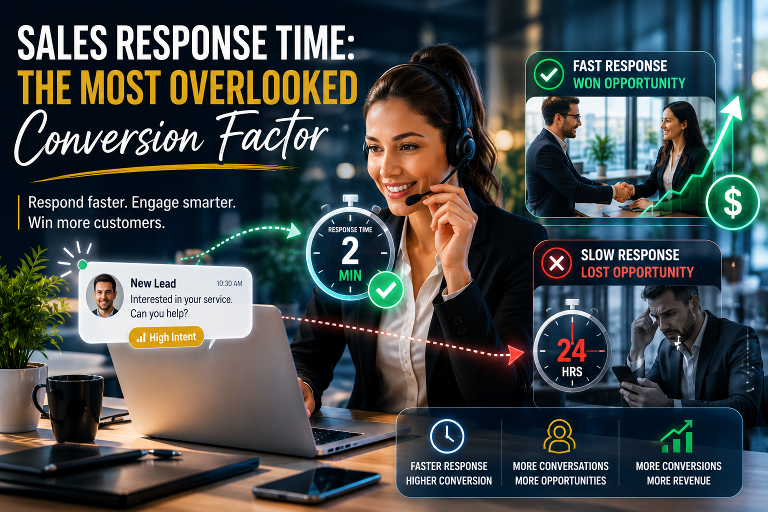
Slow support turns intent into regret
High-intent visitors often have one final question. If they cannot get an answer fast, they default to safety. Safety often means leaving.
The common assumption is that support is a “post-conversion” function. In reality, support speed can be a late-stage conversion driver.
When support is absent or slow, three things happen:
- The visitor feels alone with risk.
- The visitor opens a new tab to “check reviews,” “compare options,” or “ask a friend.”
- The visitor returns less often than teams expect. Intent decays quickly when uncertainty is unresolved.
A single moment of friction at the end of the funnel can also trigger a trust spiral: “If it is hard to get help now, what happens after I pay?”
Human interaction reduces abandonment because it changes the frame
Real-time human interaction works not because it “pushes” people. It works because it restores clarity and reduces perceived risk.
When someone can ask a question and get an immediate, relevant response, the decision stops being a private wrestling match. It becomes a guided step with a safety net. Even automated chat can help when it is tightly scoped, accurate, and designed to route complex questions to a human fast.
Human support is also a quality signal. A visible, responsive support option suggests the business expects to serve real people, not just collect transactions.
This is where many sites unintentionally underperform: they invest heavily in acquisition and mid-funnel content, then treat the final step like a sterile formality. The final step is a conversation, whether you acknowledge it or not.
What high-intent visitors are silently asking at the last step
They are not only deciding whether they want the product or service. They are deciding whether they trust the process around it.
After a paragraph of reflection, here are the questions that tend to dominate the last mile:
- “Is this total price final?”
- “Can I change my mind?”
- “How fast will I get confirmation?”
- “What if something goes wrong?”
- “Is my information safe here?”
If your final-step experience answers those questions without forcing extra reading, you will often see conversion rates rise even with the same traffic.
Diagnostics: finding the real cause of final-stage conversion drop off
Teams often fix the wrong thing because they look at the funnel too broadly. “Checkout drop-off is high” is not a diagnosis. It is a symptom.
A useful investigation typically combines quantitative signals with a close reading of real sessions. Look for repeated patterns: rage clicks, repeated field edits, sudden pauses, back-and-forth navigation, and exits after opening help content.
A practical diagnostic approach is to treat the last step like a product in itself: it has a user, a job to be done, failure states, and performance requirements.
Here are a few high-signal checks that do not require months of work:
- Field audit: Remove any field that does not change fulfillment, eligibility, or legal requirements.
- Message audit: Replace generic errors (“Invalid input”) with guidance that fixes the issue in one pass.
- Price audit: Make the full cost visible before the visitor invests effort in the final step.
- Mobile audit: Complete the process on an average phone, on cellular, with one hand.
- Support audit: Time how long it takes to get an answer during business hours, then after hours.
The goal is not perfection. The goal is to eliminate the few failure points that account for most exits.
Real-time support that helps without adding pressure
Some organizations avoid chat or live support because they fear it will feel intrusive. That is a design choice, not a fixed outcome. Support can be quiet, optional, and still highly effective.
The best-performing patterns are usually context-aware: they appear when the visitor hesitates, hits an error, or lingers on the final review. They offer help, not hype. They answer the specific question that is blocking action.
A few reliable approaches:
- Proactive, not aggressive: Trigger help after meaningful hesitation, not immediately on page load.
- Answers, not scripts: Provide direct responses about timing, refunds, eligibility, and next steps.
- Fast handoff: Route complex questions to a human quickly, with the page context attached.
- Visible reassurance: Confirm what will happen after submission, including confirmation timing.
If you do nothing else, make it easy to ask a question at the exact moment the visitor is deciding. That single change can turn “almost” customers into completed actions.
The last stage is where your operational maturity becomes visible
At the top of the funnel, branding and messaging can carry a lot. At the bottom of the funnel, operations show through the interface. Policies, fulfillment, confirmation, support, and reliability all become part of the user experience.
When final-stage drop-off is high, it is often a gift in disguise. It reveals the exact points where your business is asking for commitment without offering enough clarity, safety, or responsiveness in return.
Fix the last mile and the rest of the funnel tends to perform better too, because visitors sense they are dealing with a system that will actually take care of them once they click.